
The First Instinct: Deciding Between Colour and Monochrome
Following first instincts, trusting what caught my eye in the field and finding balance between my monochrome default and the colour that demands to stay

Anyone who has followed my photography and writing will know that I predominantly focus on black and white photography. I have made that transition in recent years. I am just drawn to black and white and tend to envisage images as such when out in the field.
That said, colour photography still has its place in my library. This week I thought I would look back through the “keeper photos” from this year to see how many were in colour. While still a low percentage, I was surprised by how many there were. I thought I would use this week’s post to share some of my favourites and also my thought process behind how and when I use colour.
When Colour Leads
I’ve written before about my decision-making process. If colour draws me to a scene, I keep it in colour. A red door against a turquoise wall. The complementary colours so striking that converting to black and white would be like transcribing a symphony for a penny whistle.

The thing about colour is that sometimes it IS the composition. Remove it, and you’re left with nothing interesting. That red door? In monochrome it’s just another rectangle. But in colour, it sings.
The Palette of the Everyday
Dawn’s Mix: Orange streetlights mixing with blue dawn light create that magical ten-minute window where the world becomes bi-chromatic. The warm/cool contrast on wet pavements is pure cinema.
Council Colours: Wheelie bins in their regulated sequence – green, blue, black, brown. The council’s colour coding becoming an accidental art installation.
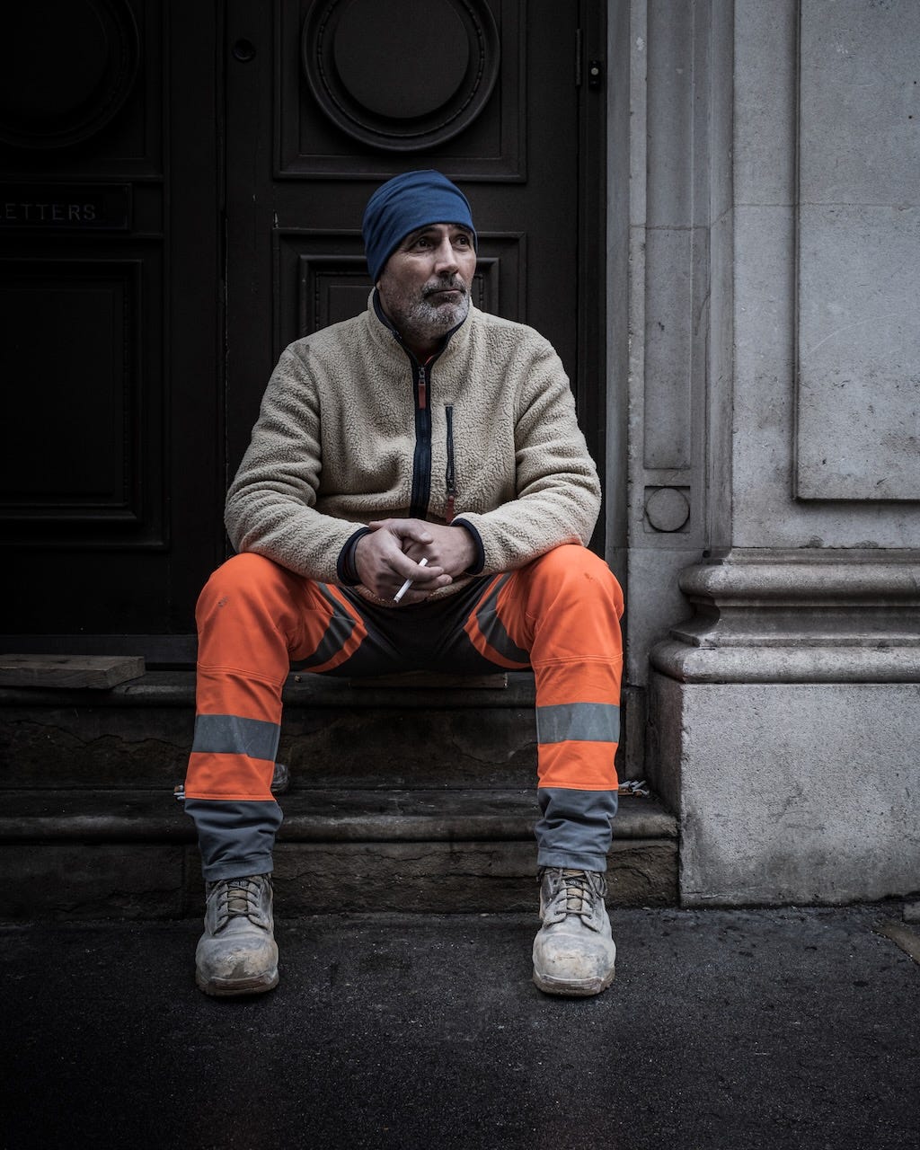
Safety First: Yellow barriers reflected in puddles, doubling the intensity. Sometimes colour multiplied is better than colour alone.
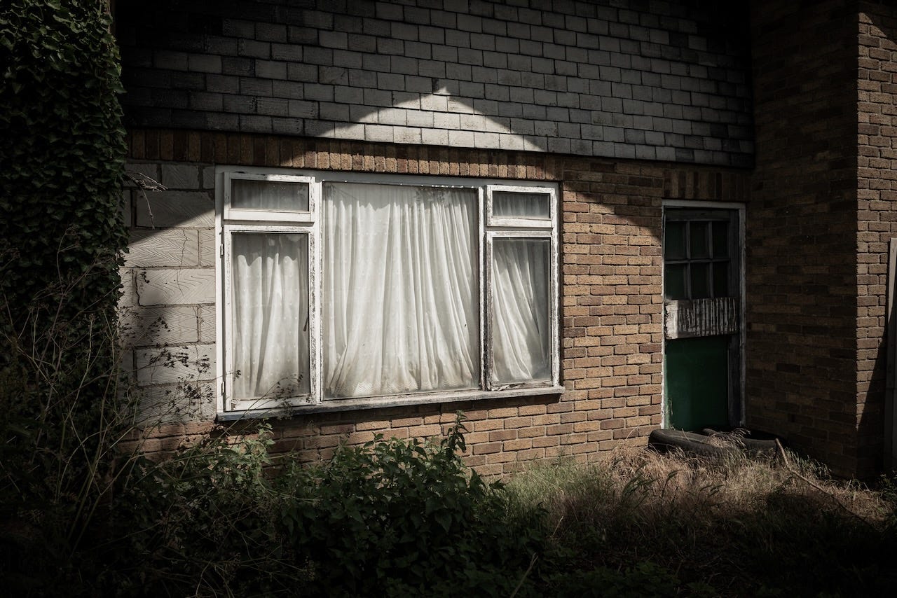
Human Touches: The painted doorways or window frames against dull and decaying brickwork. Shop fronts or warehouse cladding that is either trying to attract attention or make what would otherwise be a grey box more appealing.
Visual Punctuation in Urban Grey
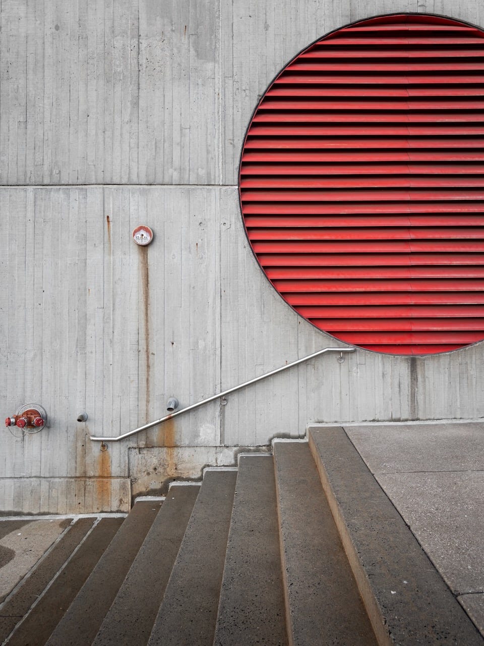
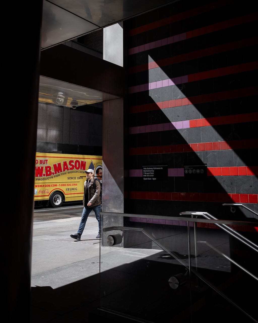
What strikes me is how colour functions in our grey urban landscapes. It’s rarely subtle. Health and safety yellow. Emergency red. Municipal green. These colours aren’t chosen for aesthetics but for visibility, for coding, for warning. Yet that functional boldness makes them perfect photographic subjects.
A single red car in an otherwise empty grey car park becomes a full stop. A yellow bollard becomes an exclamation mark. The green of the recycling bin asks a question against the brown brick wall.
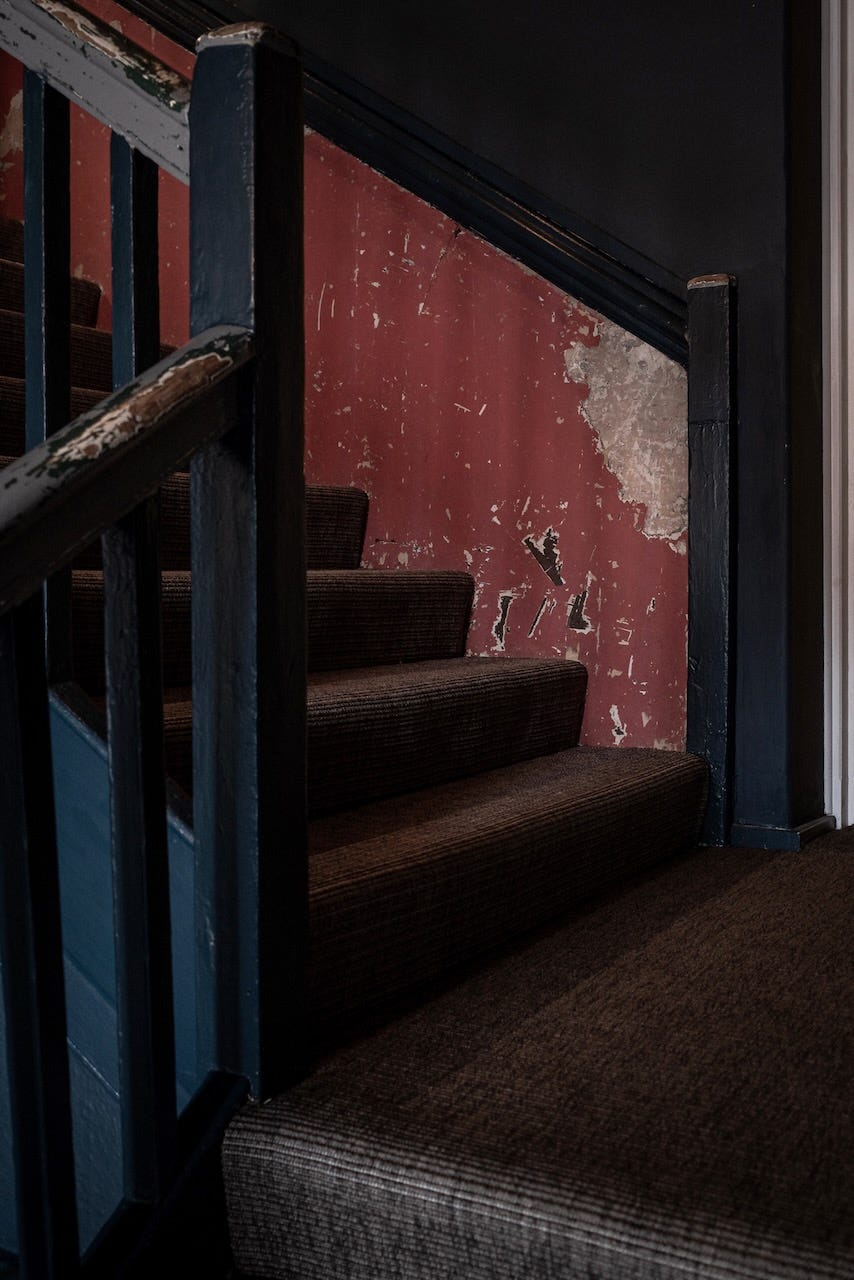
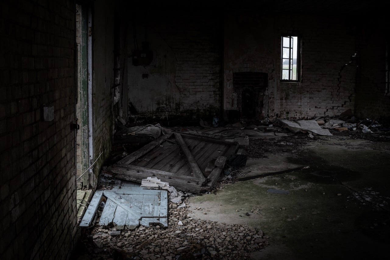
The Pull of Monochrome
I realised that I am naturally drawn to black and white for my photography. It simplifies a scene down to shapes and tones, and some may say that it adds automatic “artistic” weight. But when it’s the right choice, colour carries its own power. It doesn’t need to shout to be heard, but when it does shout, we should let it.
The challenge isn’t finding colour – it’s everywhere. The challenge is finding colour that justifies itself, that does something black and white can’t. I find it in the functional, the municipal, the everyday. The colours that are so omnipresent we’ve stopped seeing them.
Sometimes, not using colour adds its own complications. I find autumnal woodland photography specifically challenging, for example. When you don’t have the vibrant colours to lean into, you are left looking for pools of light, textures and those characterful trees to make an image. Yes it’s frustrating but it’s actually enjoyable as well. A puzzle that needs to be cracked and when it does work, it’s all the more satisfying for it.
Trusting What Drew You In
The decision between colour and black and white isn’t technical – it’s about what caught your eye first. If I’m drawn by tone, texture, form, or light, then it is monochrome. But when colour itself is the subject, when it provides the contrast or the composition, then it must remain colour.
Sometimes the most important photographic decision isn’t what to include in the frame, but whether to keep the rainbow or render it in shades of grey.
How do you decide between colour and black and white? What subjects demand colour in your photography?
I often find that the choice between switching between colour or monochrome is influenced by the sense/emotion/narrative which the image is intended to convey.
I can understand this way of thinking, and it really works so well for you.
I’m the opposite: sometimes a shot or series screams (to me) for BnW. Otherwise, it’s color, especially when traveling in a place, for example, like the mountains and fjords of Norway — particularly in the fall. That muted light, the greens of the fields, the turning of the leaves, the colors of the houses, the blue of glacier water. It just has to, for me, be color. I think I find more shots I want to edit in BnW from urban locales than from Norway’s nature.
Thanks for sharing some color. I love love love your BnW but the delicate (or more bold) treatment of color here is also nice to see and very enjoyable.